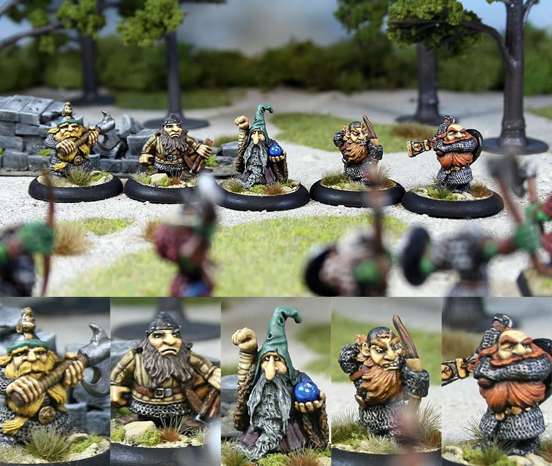
We have just started round 3 of the LPL so now I am free to post pictures of my Round 2 entry. Here again I'm working on some figures for a skirmish band so I was able to use the nice 30mm Round lipped bases...which I must admit look really nice.
Anyway...this week I chose to work up a team of Dwarfs...The ones I picked have a very "Norse" feel...lots of Chainmail....no Puff and Slash....Big axes ect. They didn't really fit with my other units so they are perfect for a small skirmish band. This has also forced me to attempt a more subdued palette...which actually turned out to be a nice change of pace.
Anyway...enough Jibb-jabber...here is my entry photo
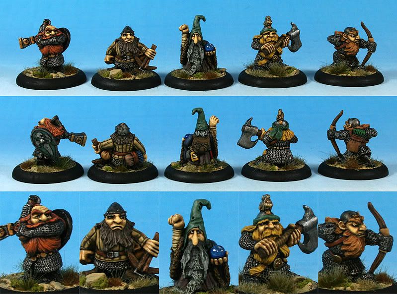
And here is the "Studio" shot of this crew
The dwarf Wizard and the Dwarf with the Bow are a great example of figures that were made for use with WFB but are no longer supported by the much more rigid "Fluff" that GW has forced on gamers in later editions...Thats why I'm happy to escape the Warhammer World with this Skirmish Band....it will be used with David Kings excellent set of rules "Skulldred"
Cheers,
Blue


I think the orcs are a little distracting. If you want out of focus models in the foreground, may I suggest having them a little farther to the edges and most importantly; not obscuring any of the actual objects? Since you're doing close ups as well you could afford having a wider shot in the main photo? I think the orcs would have worked better if they "framed" the lower part of the photo more. Don't know if you see what I'm getting at... =) I really do like the scenic shots though!
ReplyDeleteAgreed Phreedh! At the moment the out of focus orcs make up the bottom 3rd of the picture. The top third is a nice shot of some trees and a bit of sky. The middle third is the same as your studio shot. The three ain't really doing much together. It's also the big bases with little guys, they sort of cramp (or should that be stretch) your style for a group shot. There isn't really room to frame a story with your forground or put dramatic height in the photo when it has to be so long.
ReplyDeleteI love the paint and the figures, your photo doesn't do them justice.
They have a great "clean" feel to them. The muted colour scheme helps show off the personality of the miniatures.
ReplyDeleteThanks for the feedback guys. Like I said this is a learning experience for me so your advice is greatly appreciated. I'll incorporate these ideas into future pictures.
ReplyDeleteCheers,
Blue